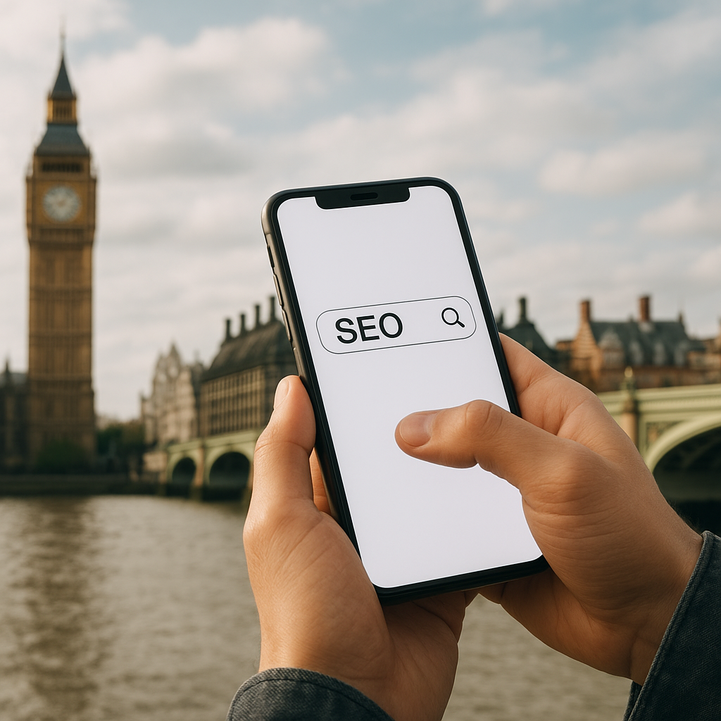
In the heart of Europe’s fastest-evolving digital marketplace, businesses in London face fierce competition to capture the attention of on-the-go consumers. As mobile devices outnumber desktops for online searches, mastering the art of mobile optimization has become indispensable for any SEO strategy. This article explores why a focus on handheld screens transforms not just page layouts but your entire approach to search, engagement, and conversion in the bustling capital of the United Kingdom.
Why Mobile Optimization Matters for SEO
Search engines like Google continuously refine their algorithm to reward websites that deliver seamless experiences across devices. When your site fails to adjust to a small screen or slow cellular connection, search crawlers interpret those shortcomings as diminished relevance. In a market as saturated as London, this can mean slipping out of prime positions on SERPs and losing vital local traffic.
Improved user experience and retention
- Frictionless navigation keeps visitors exploring your products or services.
- Faster load times reduce bounce rates and increase session durations.
- Touch-friendly menus and call-to-action buttons guide prospects toward conversion.
Search engine preferences
- Google’s mobile-first indexing evaluates your smartphone version before desktop.
- Sites with accelerated mobile pages (AMP) get preferential treatment in mobile search results.
- Core Web Vitals metrics—Largest Contentful Paint, First Input Delay, Cumulative Layout Shift—measure real-world performance on handheld gadgets.
Proven Techniques to Boost Performance on Smartphones
To secure a competitive edge in London’s digital landscape, your website must employ strategies that optimize design, speed, and content delivery for mobile devices.
Responsive layouts and flexible grids
Responsive design automatically adjusts page elements to fit screen sizes and resolutions. Implementing CSS media queries and fluid grids ensures images, text, and navigation bars realign without requiring separate mobile URLs. This approach simplifies maintenance and consolidates link equity, ultimately enhancing your ranking.
Image compression and lazy loading
- Compress photos and graphics using modern formats (WebP, AVIF) to reduce file sizes.
- Enable lazy loading so images only download as they appear in the viewport.
- Use SVGs for icons and logos to maintain sharpness without adding extra kilobytes.
Minified code and critical CSS
Streamlining HTML, CSS, and JavaScript files strips out unnecessary characters, comments, and whitespace. By inlining critical CSS above the fold and deferring nonessential scripts, you ensure content paints progressively, keeping users engaged while the rest of the page loads.
Progressive Web Apps (PWAs)
PWAs combine the best of web and native apps, offering offline access, push notifications, and near-instant loading. For London enterprises looking to deliver an app-like experience without the development overhead of native applications, a PWA can be a game-changer.
London-Specific Considerations for Mobile SEO
London’s diverse audience and dense commercial districts demand a tailored approach to reach targeted neighborhoods, industries, and consumer segments. Mobile search in London often includes location-based qualifiers: “near me,” “in Shoreditch,” or “by King’s Cross.” Capitalizing on these micro-moments requires a fusion of technical and local SEO tactics optimized for smartphones.
Optimizing Google My Business and local schema
- Claim and verify your Google My Business listing with accurate address, phone number, and website URL.
- Include opening hours, high-resolution photos, and customer reviews to increase trust signals.
- Implement LocalBusiness schema markup in JSON-LD format to help search engines understand your geographic relevance.
Voice search and conversational queries
With voice-activated assistants like Siri, Google Assistant, and Alexa, Londoners increasingly speak their queries rather than type them. Tailoring your mobile content to address long-tail, conversational phrases—“best vegan brunch near Old Street station”—can capture this growing segment of search traffic.
Hyperlocal content strategies
- Create location-specific landing pages to target boroughs such as Camden, Hackney, and Westminster.
- Incorporate neighborhood landmarks, public transport hubs, and cultural events in your copy.
- Develop mobile-friendly blog posts or guides, like “Top 10 River Thames Walks,” that naturally attract inbound links and social shares.
Measuring Success and Continuous Improvement
Effective mobile SEO in London hinges on ongoing analysis and refinement. Combining quantitative metrics with qualitative feedback enables you to identify weaknesses and iterate swiftly.
Key performance indicators
- Mobile organic traffic growth to assess overall visibility improvements.
- Average mobile page load time against industry benchmarks.
- Conversion rate from mobile visitors compared to desktop counterparts.
- Engagement metrics such as scroll depth, time on page, and event completions (e.g., form fills, calls).
User testing and real-world audits
Deploy tools like Google Lighthouse, PageSpeed Insights, or WebPageTest to simulate mobile network conditions. Complement these results with user testing sessions on various devices—iOS and Android phones of differing performance tiers—to capture authentic experiences.
Adapting to algorithm updates
Search engines release frequent tweaks that can shift the mobile SEO paradigm overnight. Maintain relationships with London-based SEO communities and attend industry meetups to stay informed on changes related to Core Web Vitals, mobile indexing, and search layout modifications.